SPRING 2024
ZEST ITERATIVE REDESIGN
WORK TYPE
CLIENTzest
CONTEXTuser interfaces & user
experience (CSCI1300), brown university
TIME3 weeks, ~8 hours/week
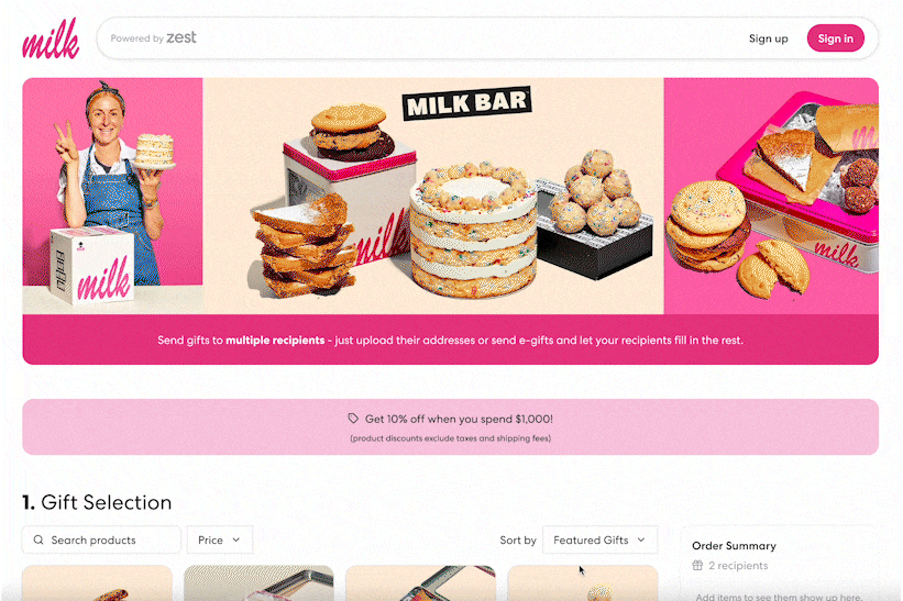
our team of designers worked with
Zest, a corporate gifting platform, to develop interface
changes to accomodate a new shipping option for bulk
ordering.
WORK TYPE
CLIENTzest
CONTEXTuser interfaces & user experience
(CSCI1300), brown university
TIME3 weeks, ~8 hours/week
our team of designers worked with
Zest, a corporate gifting platform, to develop interface changes
to accomodate a new shipping option for bulk ordering.
> IDEATION
> WIREFRAME
> CLIENT & PEER CRITIQUE
> STYLE GUIDE
> HI-FI PROTOTYPE
> CLIENT PRESENTATION & FEEDBACK
> CLIENT FEEDBACK REVISION
IDEATION
BRAINSTORMING
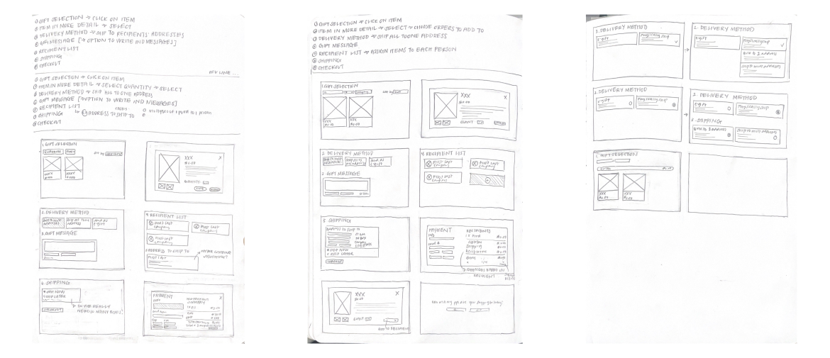
we began addressing our prompt with divergent brainstorming. each team member brainstormed two end-to-end flows for possible implementations of a bulk shipping process. in our discussion, some elements were relatively consistent, like the new shipping method belonging to the delivery method section or having a form of per-recipient total. other items, like how one would select the bulk shipping option, varied greatly from checkboxes to radio buttons to dropdowns.
we began addressing our prompt with divergent brainstorming. each team member brainstormed two end-to-end flows for possible implementations of a bulk shipping process. in our discussion, some elements were relatively consistent, like the new shipping method belonging to the delivery method section or having a form of per-recipient total. other items, like how one would select the bulk shipping option, varied greatly from checkboxes to radio buttons to dropdowns.
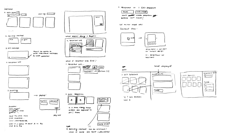
CONSIDERATIONS
in our process, many questions arose.
- since users who choose to ship to one address are likely bulk ordering (e.g. for 100+ people) and likely won’t want to personalize gifts for each recipient, are per-recipient UI elements necessary at all?
- how do we want to enable bulk shipping? Some ideas from our sketches included a drop-down menu, a simple checkbox, and a third box in the delivery method section.
- is a shopping cart necessary? How will it interact with the rest of the user flow?
WIREFRAME
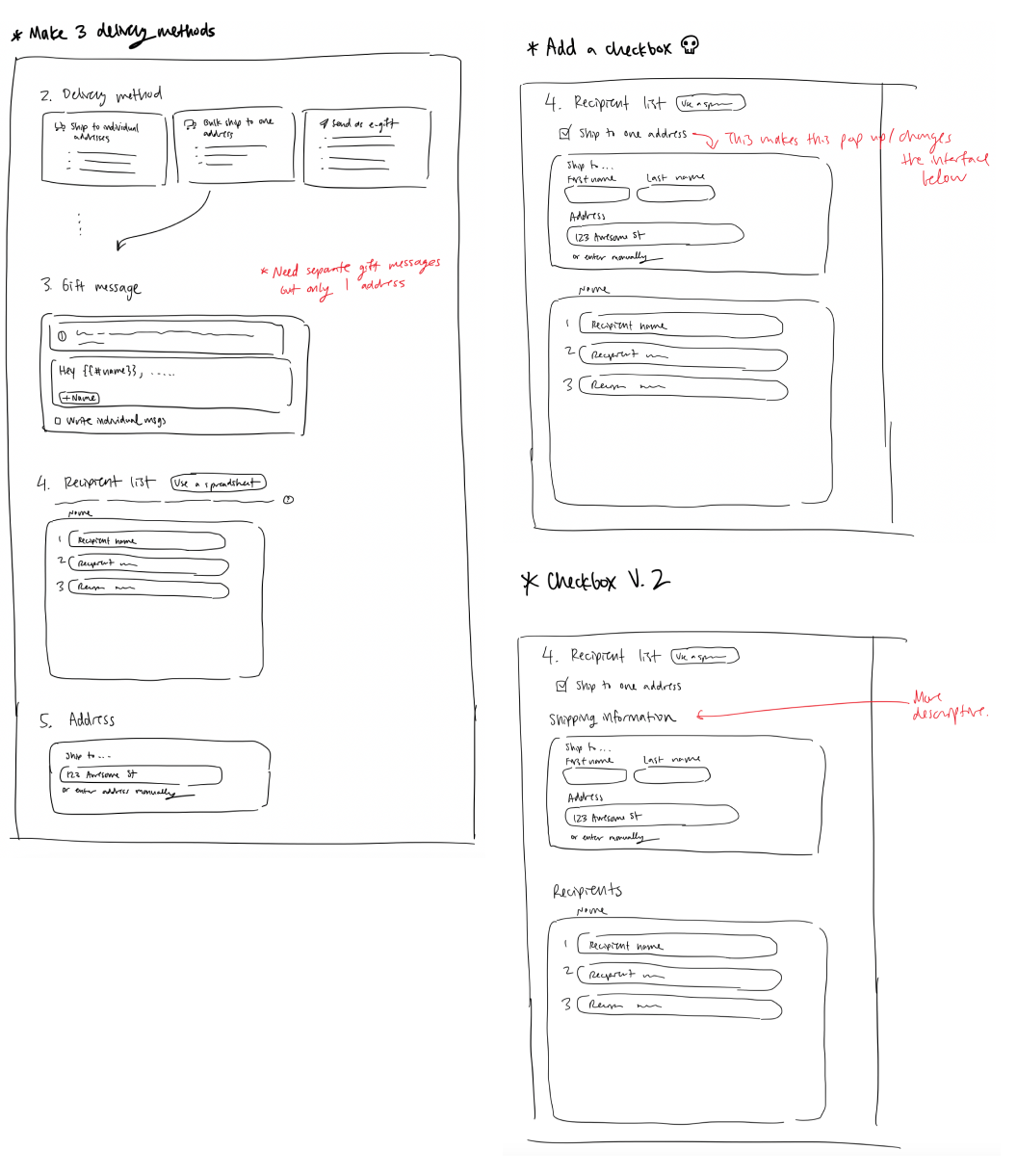
INITIAL DESIGN DECISIONS (SKETCHES & WIREFRAME)
we tackled these questions by doing an initial wireframe and making some design decisions for feedback.
- decided to add our delivery method under “ship to recipients’ addresses” option
- chose between a drop-down, a checkbox, or a third option in delivery methods. we felt that it should be of equal importance to ship to individual addresses, so we chose dropdown and third option over checkbox
- added an order summary with total per recipient or bulk shipping, to clearly communicate totals after shipping
- summary had added effect of less clicking back and forth between checkout and main page, which was required to view total details
- removed addresses from recipients list, as bulk shipping uses a single address
- users can now ship to one address without emailing customer service 🙂
CLIENT & PEER CRITIQUE
we then participated in a critique with around 20 other students
in our studio to get unbiased feedback (since none of them were
familiar with Zest prior). we created a Loom video to walk
through our wireframe.
- From the critique, we learned that we should talk about and analyze competitors in our process and include sketches in the beginning to show our entire design process from start to finish.
- Some specific feedback we received included making the boxes the same size for each delivery method and making it more intuitive to switch between pages of the gift options.
after creating a wireframe, we met up with our instructor,
Vanessa Cho, for a check-in. we gained the following
insights:
- talk about and analyze competitors in our process
- include sketches in our check-in to show our entire design process from start to finish
- the specific language we choose is important. for example, does the phrasing “ship all to one address” make sense?
- minimize extra clicks as much as possible
- some specific feedback we received included making the boxes the same size for each delivery method and making it more intuitive to switch between pages of the gift options.
finally, we received feedback from our client, Christine Pun,
Founding Designer at Zest, who gave us the following
feedback:
- she was curious about why we broke our shipping methods into two instead of three. we realized that we chose this primarily for aesthetic reasons and ultimately decided to switch back to our original solution of one box for each shipping method since it was more intuitive–users would likely be confused about why there are two options under one shipping method.
- additionally, christine was curious about how the cart would look like on mobile, so we decided to prototype the primary page for mobile as well.
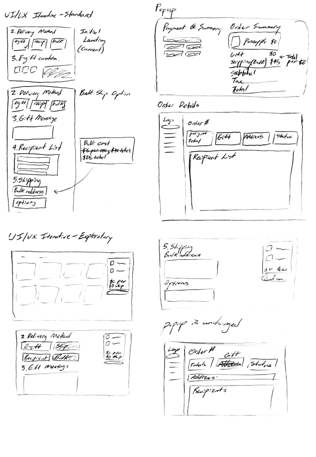
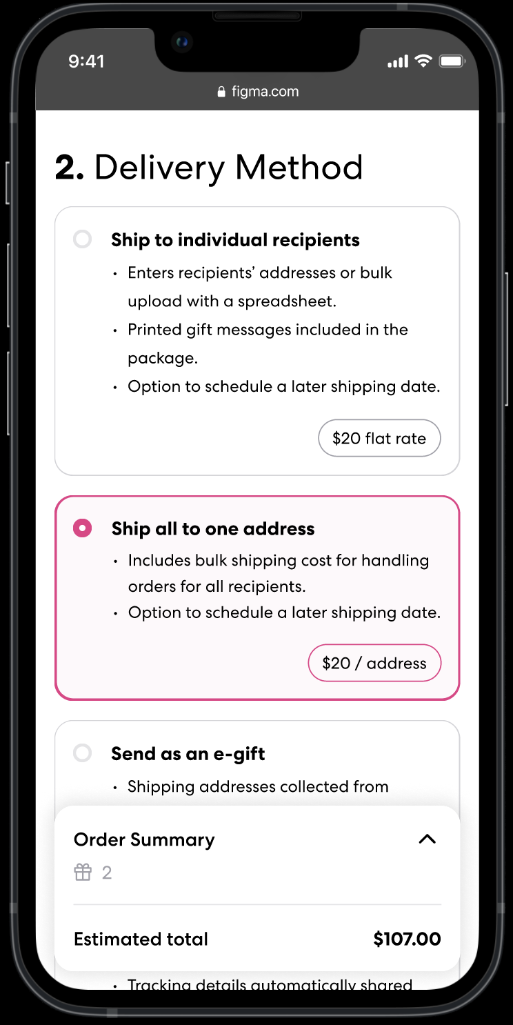
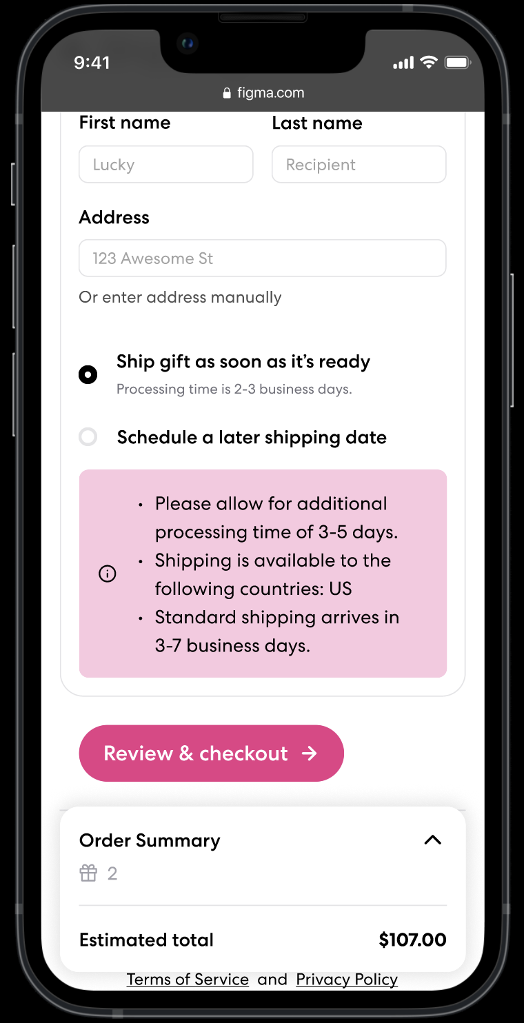
because there were no major design changes to the wireframe, we chose to move quickly to the high-fidelity prototype, as zest requested a mobile prototype as well.
we integrated our minor design changes, including changes in language and two to three delivery options, directly in our high-fidelity prototype.
STYLE GUIDE
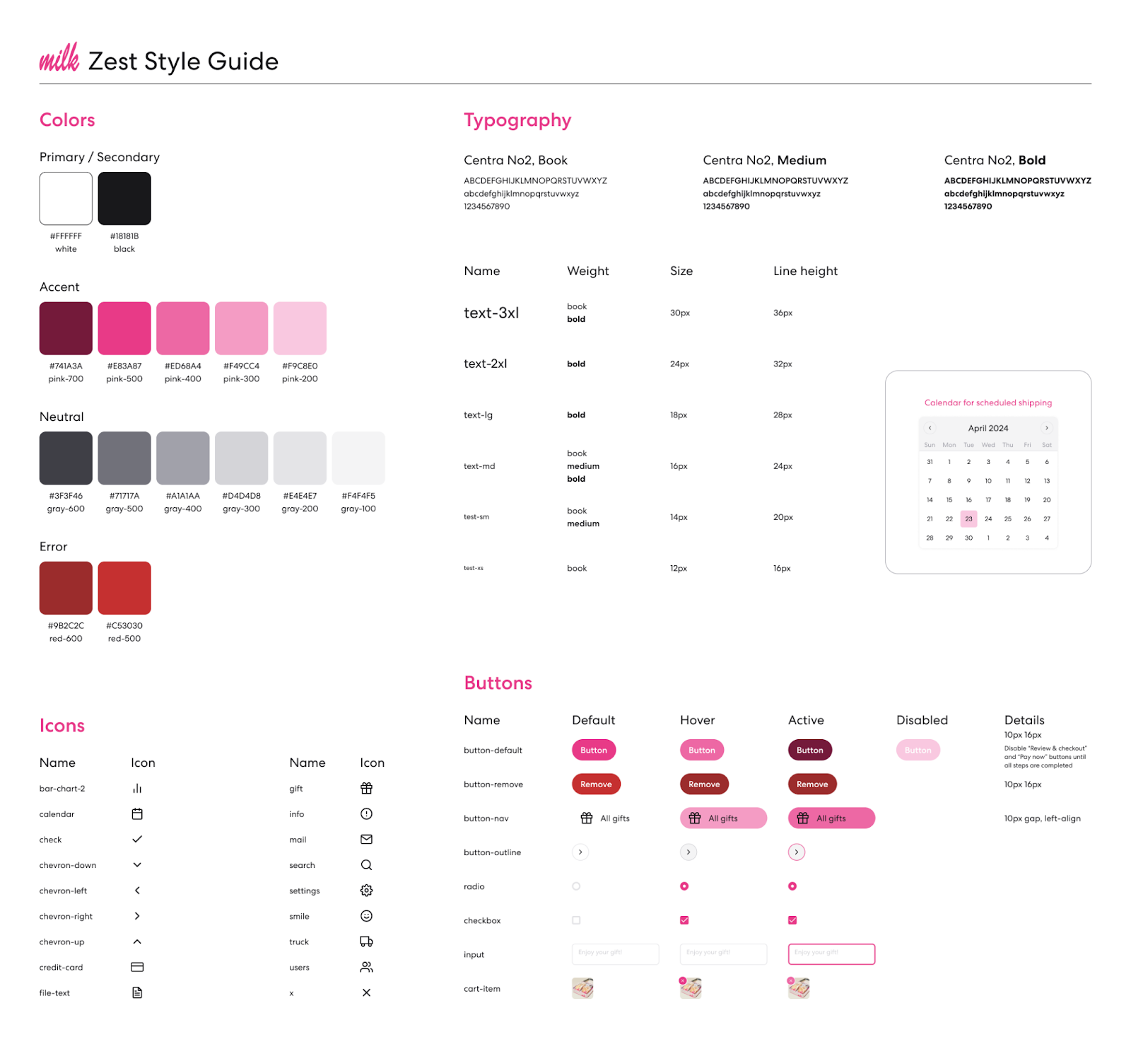
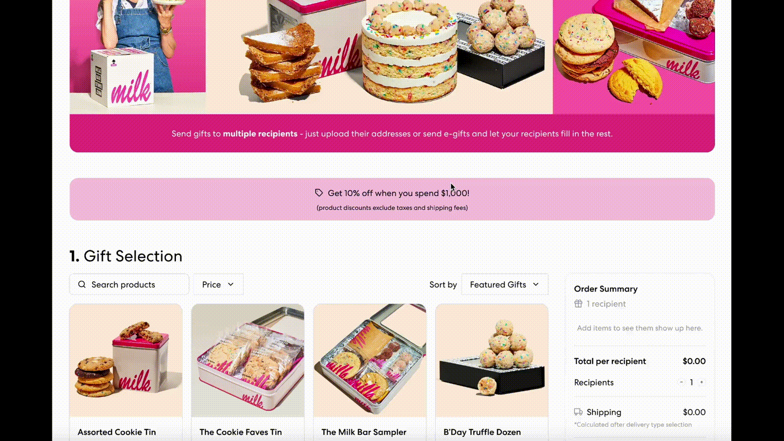
since we were given hi-fi Figma screens to iterate on, we at
least had something to work off of, and it was just a matter of
consolidating the information. we used Milk Bar as an example
brand and based our style guide around that. we noted that Zest
used the colors of the brand they’re working with, which we
believe is to allow for more personalization and brand
identification from the perspective of the brand they’re working
with.
we believe that they chose a sans serif typeface with no styling like Centra2 for readability. additionally, the text size is the same across mobile and desktop to allow for responsiveness to be implemented easier. in terms of what we added to the style guide, we added a few more icons as we saw fit, created the option to remove a cart item on hover, and a custom calendar when selecting a delivery date.
we believe that they chose a sans serif typeface with no styling like Centra2 for readability. additionally, the text size is the same across mobile and desktop to allow for responsiveness to be implemented easier. in terms of what we added to the style guide, we added a few more icons as we saw fit, created the option to remove a cart item on hover, and a custom calendar when selecting a delivery date.
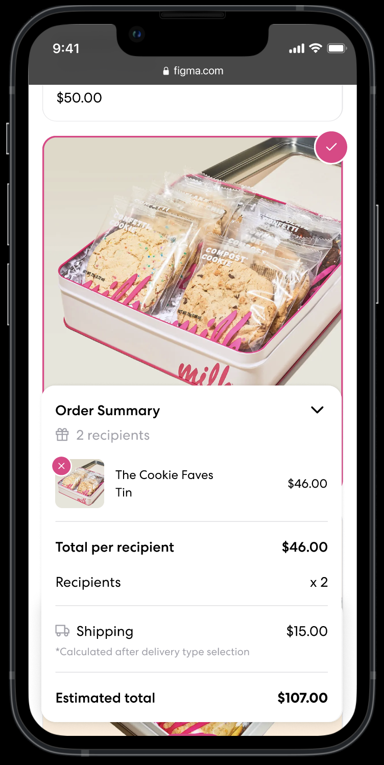
HI-FI PROTOTYPE
CLIENT PRESENTATION & FEEDBACK
finally, we presented our hi-fi prototype to Christine and
Jeremy, a co-founder of Zest, and they gave us some pointers for
our design:
- doing user tests could help with confidence in our design choices. for example, trying a version with a cart versus without a cart could help us get a sense of how users interact with the interface.
- having the option to change the number of recipients within the cart interface could be explored.
- the order of sections on the page is important and something they have to consider deeply! for example, some companies want the ability to customize the catalog depending on shipping method, but it may be jarring if an earlier section changes based on the user’s selection in a later section.
CLIENT FEEDBACK REVISION
during our meeting with the founder, the main point of
improvement we discussed was having the number of recipients be
an editable field in the order summary, rather than something
only accessible via one of the larger page sections. this would
allow the users to edit the number of recipients as they were
ordering, which might make more sense for the entire flow as a
buyer navigates the ordering process.
as such, we added an input field in the order summary so that users can increase or decrease the number of recipients, but set the default number of recipients to 1 so that the default total computation would be easier to understand at first glance. this would also update as users change the number of recipients in the “Recipients” page section during the main page flow to stay consistent with the general flow.
as such, we added an input field in the order summary so that users can increase or decrease the number of recipients, but set the default number of recipients to 1 so that the default total computation would be easier to understand at first glance. this would also update as users change the number of recipients in the “Recipients” page section during the main page flow to stay consistent with the general flow.